
 Tweet
Tweet
-
-
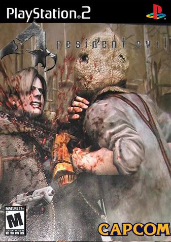
7/10
The logo still has some white on it and its had its resolution modified. Other than that though it looks good
-
thanks for the rating
Comment
-
The Four looks abit stretched but other than that it looks good 8/10Comment
-
That looks pretty good. Only problems I see is what Dot pointed out with the letters still having some white in them, and the 4 being a little stretched out like Rusty said. Other then that, It's good. 7.5/10.Comment
-
The screenshot is badass, there's nothing like watching someone being cut in half with a chainsaw. (god I'm sadistic, hehe) The logo needs a LOT of work, I'd personally have created a custom one that looks a lot more 3-D (read: try the Bevel and Emboss options in photoshop) but you get an A for effort, so I give it a 7.Comment
-
Thanks guys, I really needed some hardcore fan input.Comment
-
Wasn't that what they originally showed as the boxart for the GCN version? Except... with Gamecube on it instead of Playstation.Comment
-
The Playstation Black Bar thing bends, the RE4 text is squished, and the Capcom logo has a black outline around it.
Fix these and you might win.Comment
-
I honest to god don't know.Originally posted by NikovichComment
-
I like the feel and idea of it. But to sound like a broken record, the problems come from the logo. In addition to what the others said, the logo is obscured by the background image as well. It's a very fine attempt though.
Comment


Comment