
 Tweet
Tweet
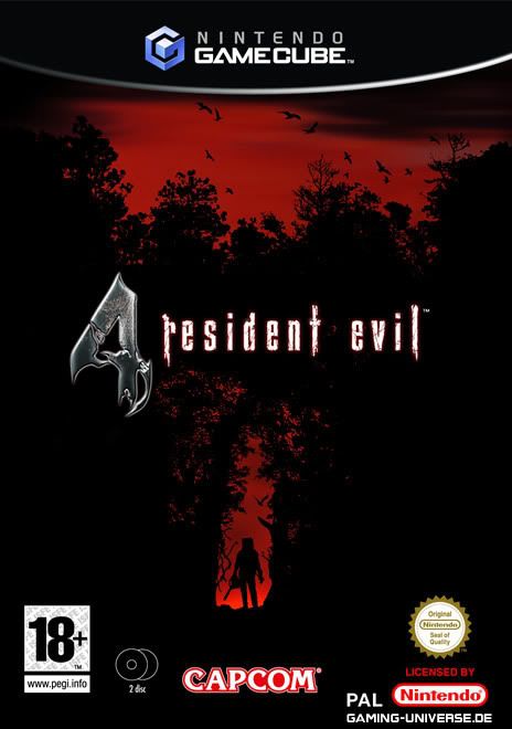
The PAL Resident Evil 4 it honestly makes you think your in the woods and such, and well it lies! it makes the game seem more creepy and badass then it actually is.
-
-
I like the RE2 PAL box art. Biohazard Outbreak wasn't bad either. I never liked the RE3 cover. And I always thought the RE1 original cover was weird as it didn't really look like any of the characters, just some weird guy.
Also the BH CODE: Veronica red box art was pretty good.Last edited by Scream; 03-05-2009, 12:56 AM.Comment
-
Yeah the long box RE1 I used to think was Chris, but this guy looks like a zombie or a man with half a melted face with a gun thats not in the game and looks like he is dressed for Urban city combat.-shruggs-Originally posted by Scream View Post
I like the Outbreak with the zombie hands coming from the side, pure.. West.
Comment
-

- Best RE cover everComment
-
Again, this is the absolute best gaming cover EVER. It reaches far beyond the confines of "Best RE Cover" and rules all of gaming.Originally posted by aris13 View PostComment
-
As great as all these RE/BH covers are, they will never match the epicness that the original Megaman had for NES.Comment
-
All my favourites are UK covers....I love them all, with File #2s being near the top and CV:X's near the bottom.
Am I the only one who isn't a fan of the American art? I think there's just something...off about them. But then I seem to think that about American book covers and the such, maybe I'm just prejudiced against them
Comment
-
-
I love this one, and prefer it to the US cover (especially the title font, for some reason I think it looks a lot nicer than the one used for the US, shame we didn't get it until 4)Originally posted by Town of Green View Post
As for some of my favorites:


^ (If this doesn't scream "ACTION GAEMS" then I don't know what does)

Comment


Comment